SILVER BRUSH LIMITED
A freelance brand redesign project
Brand Redesign Case Study
Artist Paint Brush Sets
Silver Brush Limited is an internationally known art supply company with a long history specializing in quality artist paintbrushes for all media including oils, acrylics, and water based media. We connected during their search for a brand designer who could help them reimagine the packaging for their various brush sets.
This case study paints an overview of the process behind the completion of this project including the unique challenges to overcome and small victories along the way.
After researching their company, space, and competitors, I was better equipped to help create solutions for the challenges this project posed and help reveal the unique assets Silver Brush had to pull on, the final result achieved all desired goals, and then some!
The Silverwhite before and after examples below showcase how the implemented design-changes help elevate the perceived value of the sets to more accurately convey the quality of the brushes enclosed.
PACKAGING - BEFORE AND AFTER

AN IMPORTANT NOTE
FOR ANY BRAND DESIGN PROJECT
The research and development stage is hands down the most important focus when starting a project for a new company. Artists and designers can absolutely have their own style that they bring to the table, and often times this is the deciding factor in a company choosing one designer over another, but the most important thing is finding the company’s true voice to best reach their target demographic.
To be able to intentionally fit in, or to be able to intentionally stand apart, the designer first has to thoroughly know the company, the competition, the current space, and the target demographic. Unfortunately this means that a large part of a brand design’s initial cost goes into time that will not yield visible results, but is also one of the most important steps for the success of the final product.
IDENTIFYING ASSETS
FINDING THE VOICE:
It's about the artists
As mentioned above, the main goal of this rebrand was to elevate the perceived value of the products to better match the quality of the brushes while keeping packaging costs reasonable.
As with any new project, the first step is to know the goals, rules to follow while proceeding, and challenges to overcome to reach those goals.
Challenges in concepting the design:
- The actual brushes had to be visible rather than just showing images of the brushes
- The packages had to be able to fit any combination of available and future paintbrushes
- To minimize customization cost, we needed to limit the number of dielines to 5-6.
- Because these are sold across north America, including Quebec, all copy that is not a line name must appear the same size in English, French, and Spanish
THE SOLUTION: COMPLETELY CUSTOM DESIGNS

Given the unique challenges this project faced, there was no easy “one-click” package solution and required the design of a completely custom two part package layout. The inner tray has wings custom fit to friction lock the inner tray into place.
While the tray has interlocking arms to help keep the shape, these were removed in subsequent print runs as they slowed down the construction and were deemed unnecessary as the packages held together just fine without them.
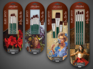
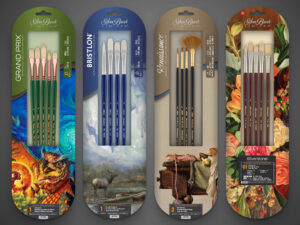
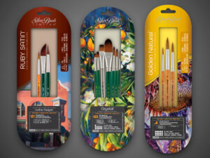
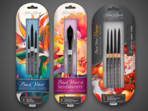
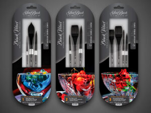
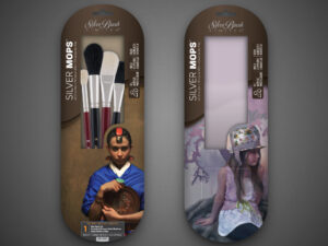
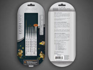
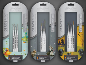
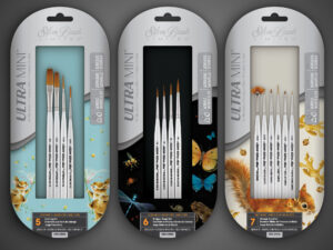
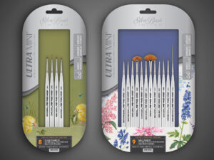
The initial brand redesign consisted of 45 packages across 13 lines. The gallery below shows examples of about half of those packages, but also shows how the different lines interact with each other. You can see in the Ruby Satin® image different package sizes within one line. The next image shows multiple product lines (and one generic package) all using the same long-handle package dieline. The Silver Mops™ packages show an available set vs a generic package for testing future sets and the Ultra Mini® packages show how every set features different artwork.
Special & Unique Sets
STANDING ALONE IN A CROWD
A fun challenge with this project was the need to create a few specialty sets that felt part of the brand family, but also stood out as unique and special.
The Artist Select brush sets that more prominently feature an artist’s work are a good example of my solution to this challenge. The package and window shape, logo treatment, and information box allow no question that these sets are part of the Silver Brush brand, but the change in brush line name information and graphic design layout set them apart from the normal line packages.
After the initial package brand design project was completed and the 45 package artwork files were sent to the package manufacturer, there have been many additional projects updating and bringing SBL’s graphics into line with the brush set branding.
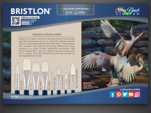
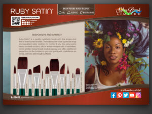
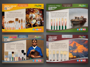
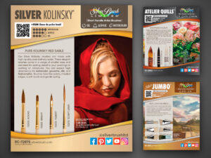
I created a style guide (brand book) to help SBL keep quality and design standards consistent if and when they hire other artists, photographers, or web designers and a catalog to showcase the new brush lines for their customers. Retail store brush display header cards were also needed and I utilized the brush set brand design to ensure SBL’s customer facing material exhibited consistency. I was also able to help them with convention banners and a slight convention booth remodel.
Silver Brush Limited is an ongoing client and, while they have given me permission to use work I have done for them in my portfolio, they have a flourishing and constantly busy company and I don’t think they would appreciate being contacted regarding this ongoing project. Please respect their time by not interrupting their business.
A verifiable five-star review and recommendation from Silver Brush’s owner can be found on my Upwork freelancing profile, found here. Please contact me if you have any questions.
Thank you for your time!
Thank you for reading about this fun yet challenging Silver Brush Limited rebrand project. If you enjoyed this exploration into my process and would like to see more, check out the National Geographic STEM Science Toy line rebrand case study!

