NATIONAL GEOGRAPHIC
CASE STUDY: REDESIGNING A BRAND
Brand Redesign Case Study
STEM Science Toy Line
SCIENCE, TECHNOLOGY, ENGINEERING, & MATHEMATICS
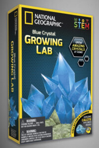
Despite the amazing amount of workload required of my design team at JMW, there came a time when I was able to focus on rebranding our considerable amount of National geographic STEM science toy products. While fairly strong sellers, the branding designed by a previous artist was holding the line back from true retail greatness.
The tipping point came when retail chain Target rejected JMW’s application for in-store placement. I was told that we had two weeks to rebrand and produce 26 samples for a follow-up meeting our company’s owner had with Target’s reps.
My goals for this redesign focused on bringing more appeal to our intended demographic. With an intended age range of 8-14 year olds, the black bar version (shown below) lacked appeal.
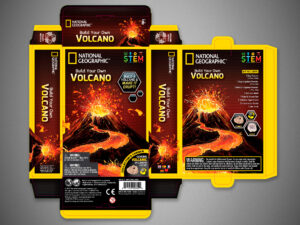
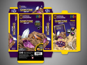
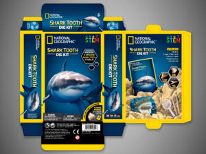
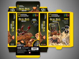
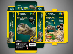
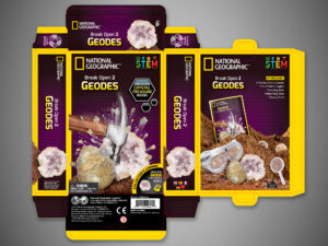
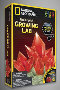
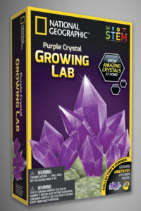
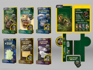
Correcting that issue included adding brighter colors with more exciting artwork to attract a younger audience and upgrading to a higher quality feel with special finishes like a spotUV layer would raise the item’s perceived value. Finally, I focused on a clean and intentional design that could easily translate across hundreds of products no matter the package layout and dimensions.
PACKAGING - BEFORE AND AFTER

After finishing my branding and layout redesign for the new packaging, my team rallied and with a week of double and even triple shifts, we presented 28 sample products with the new updated “yellow border” design (shown above right) instead of the requested 26, which gave the owner of the company the ammunition he needed to turn Target’s previous “no” to a “YES” and secure the deal.
FINAL DESIGN
THE PROOF OF THE PUDDING IS IN THE TASTING
Founder of JMW Sales (now Blue Marble)
CASE STUDY: BRAND REDESIGN
National Geographic
ABOVE & BEYOND
GOING THE EXTRA MILE
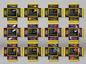
Although we were on an extremely tight deadline, I fought for every inch of that package to meet my level of quality, which required the package backs be as exciting as the fronts.

REMAKING EVERY SINGLE PACKAGE
Now that the redesign was done, time for the real work to begin!
CASE STUDY: BRAND REDESIGN
National Geographic
OUTSIDE OF THE BOX
A NEW PACKAGE STYLE
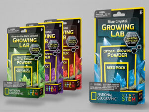
When the owner of JMW returned from a trip overseas with a new interest in the possibility of offering products in clam shell packages with layers and depth, it was a nice change in pace from what the company had been doing up to that point.
The main challenge was figuring out how to best design the packaging in a way that our overseas manufacturing team would be able to easily and quickly construct. I will admit, however, that challenges like this make creating unique packaging one of my favorite types of projects.
Shown here is an example of a Photoshop mock-up I created to convey what the packaging would look like but was actually also used for our sell sheets, catalogs, and amazon pages. If I had known the extent the files would be used and if I had more time to work on it, I would have included highlights simulating the plastic clam shell rather than just the floating panels.

I was frequently required to concept and construct digital packages like this for products before the item had even been designed, let alone hold an actual sample.
CASE STUDY: BRAND REDESIGN
National Geographic
DISPLAY DESIGNS
FOR IN-STORE RETAIL SPACES

WILDLIFE WOW!
Bringing animals to life!
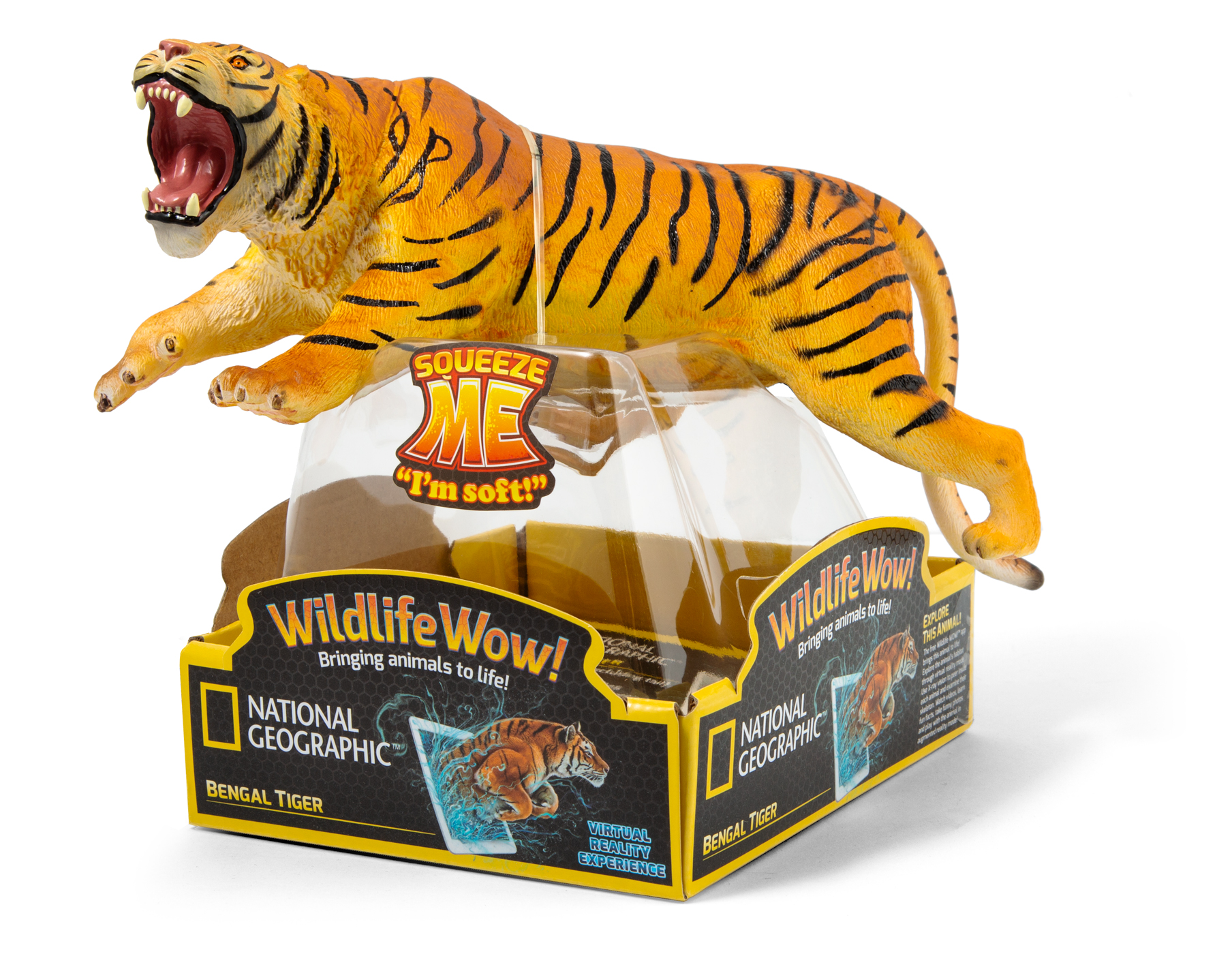
With the new “Yellow-Border” brand redesign was finalized and in place, the process of adding new products became fairly quick and easy. One exception, however, was a new group of items added to the Nat Geo STEM line-up.
CASE STUDY: BRAND REDESIGN
National Geographic
WILDLIFE WOW!
SOFT FIGURES WITH AUGMENTED REALITY APP

PACKAGE DESIGN
FOR 60+ UNIQUE FIGURES
UI DESIGN
FOR COMPANION APPS

The initial catalog sell-sheet I designed for the line while finalizing the packaging, insert cards, retail displays, and UI app interface was the double-sided tri-fold shown below. While I tended to average around 60-80 hour workweeks for the years I worked at this company, this kind of workload found me topping out at 122 hours in one week.


Thank you for your time!
Thank you for reading about this fun yet challenging National Geographic rebrand project. If you enjoyed this exploration into my process and would like to see more, you can check out the Silver Brush Limited: Artist Brush Set rebrand case study.


